


გადმოწერე აპლიკაცია
პირველი სრულად ციფრული უძრავი ქონება საქართველოში.


პირველი სრულად ციფრული უძრავი ქონება საქართველოში.
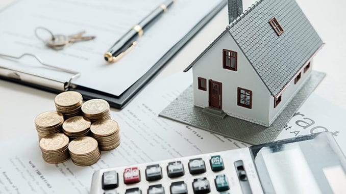
უძრავი ქონების ფასები წინა წელთან შედარებით, თითქმის იმავე ნიშნულზეა.
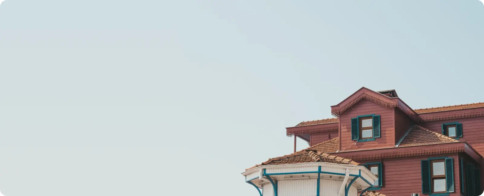
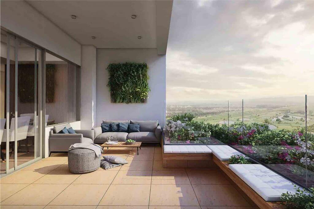
როდესაც გეგმავთ მოგზაურობას საქართველოს ირგვლივ, კარგი დასარჩენის არჩევა კრიტიკულად მნიშნველოვანია.
ბინები ქირით / binebi qirit - ხშირად მოგისმენიათ ეს ფრაზა ან წაგიკითხავთ ინტერნეტში.
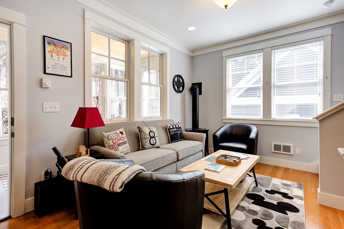
ბინის გაყიდვა საკმაოდ შრომატევადი და მტკივნეული პროცესია ყველა ჩვენგანისთვის, თუმცა არსებობს საკვანძო საკითხები, რაც აუცილებლად უნდა გავაკეთოთ გაყიდვამდე.
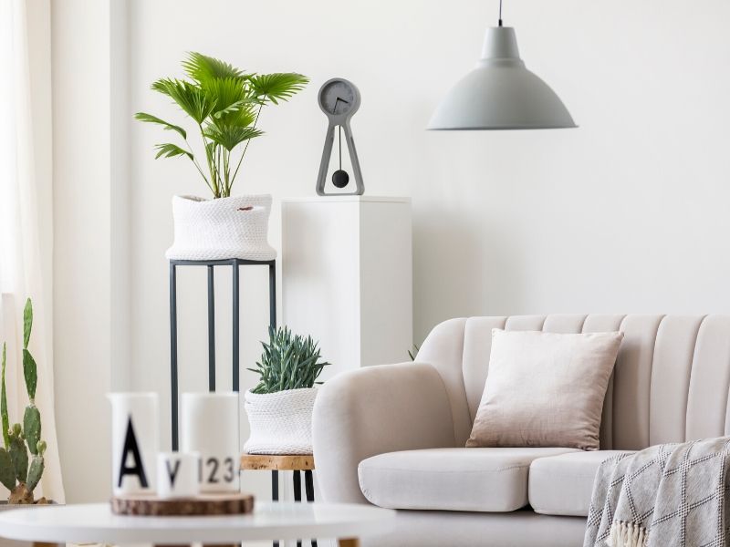
დალაგება არ არის ბევრი ადამიანის საყვარელი საქმე. ეს იმიტომ რომ როცა ვალაგებთ სახლს, როგორ კარგადაც არ უნდა გავაკეთოთ ეს, რამდენი დროც არ უნდა დავუთმოთ მას, სისუფთავე დიდხანს არ ძლებს და შესაბამისად ჩვენი შრომა და დროც ფუჭად იკარგება.
მტვერი საკმაოდ დიდ პრობლემას წარმოადგენს, არ აქვს მნიშვნელობა ალერგიული ხართ თუ არა მტვრისადმი, მისი დანახვა არავისთვისაა სასიამოვნო... ამ სტატიაში წარმოგიდგენთ რამდენიმე ხრიკს რითაც შეძლებთ შეამციროთ მტვრის რაოდენობა თქვენს სახლში.
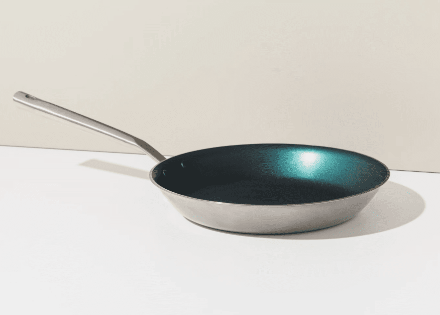
ალბათ ყველასთვის ნაცნობია სიტუაციაა, როცა ქურაზე ქვაბით ვდგამთ რძეს ასადუღებლად ან ვუმზადებთ ბავშვს ფაფას. თუ ცოტახანი გადავიტანთ ყურადღებას სხვა რამეზე, ქვაბი უკვე დამწვარია და საჭმელიც გადმოსულია. ყოველივე ამის გასაწმენდად კი დიდი ძალისხმევა გვჭირდება და სამწუხაროდ ზოგჯერ ჩვენი გარჯა არ შველის დამწვარ ქვაბებს...
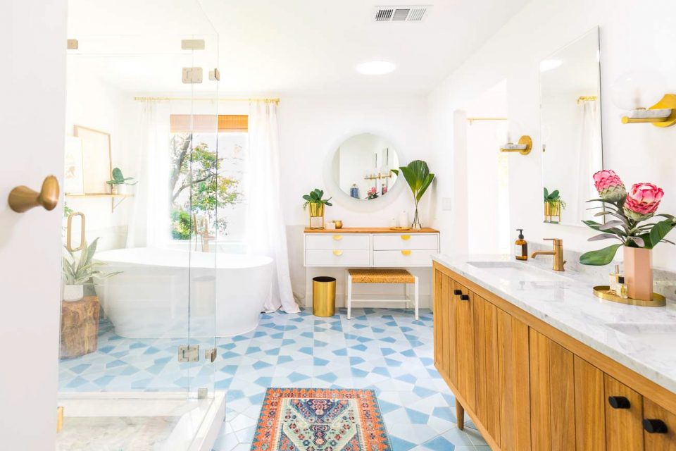
ზოგჯერ საჭიროა ჩვენს სახლში გარემოს შეცვლა, ჩვენი აბაზანა კი იმსახურებს ახალ და განსხვავებულ იერს.
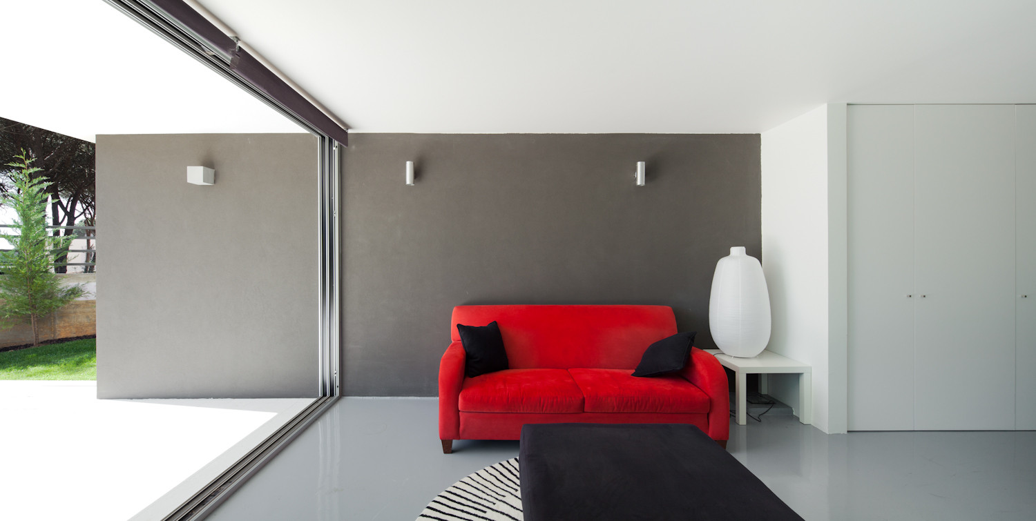
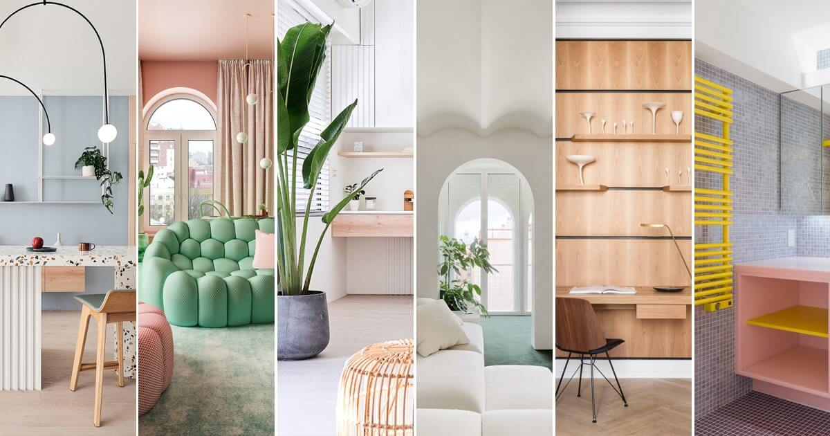
სტატიის დახმარებით გაიგებთ თუ დაზოგოთ მეტი სივრცე სახლში.
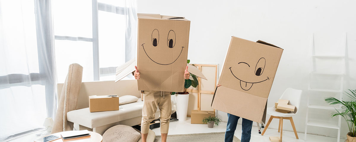
ზოგჯერ ცვლილებები საჭიროა ადამიანის ცხოვრებაში, თუმცა ფიქრები იმაზე თუ რამდენ ძალისხმევას მოითხოვს ყოველივე ეს ხშირად გვაფერხებს. სწორედ ასეა საცხოვრებლის შეცვლის შემთხვევაში, ადამიანები მაქსიმალურად ცდილობენ თავიდან აირიდონ გადაბარგების სტრესი, მაგრამ რა მოვიმოქმედოთ თუ სხვა გამოსავალი არ გვაქვს?
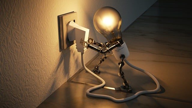
ელექტრო ენერგიის დაზოგვის საკითხი ყოველთვის აქტუალური იყო...